
In a senior user interface design course, we were tasked to conduct research for a selected design domain to understand users’ needs and goals for potential application opportunities. Seeing that Canada is home to some truly stunning scenery, more people are gaining interest in camping within the past decade. However, there are currently no application that can provide detailed information about camping all in one app., campers are usually required to open up several tabs and apps to look for the information they need. We saw an opportunity to create an application that serves as an all-inclusive platform for both beginners and experienced campers.
↳ To view the full version of case study, please go to Medium :3
View Full Case Study on Medium
Team
Junyi Shi, Zoe Yuan, David Gu
My Roles
User research, User testing, UX design, Interaction Design
Tools
Figma, Protopie, Illustrator, Photoshop
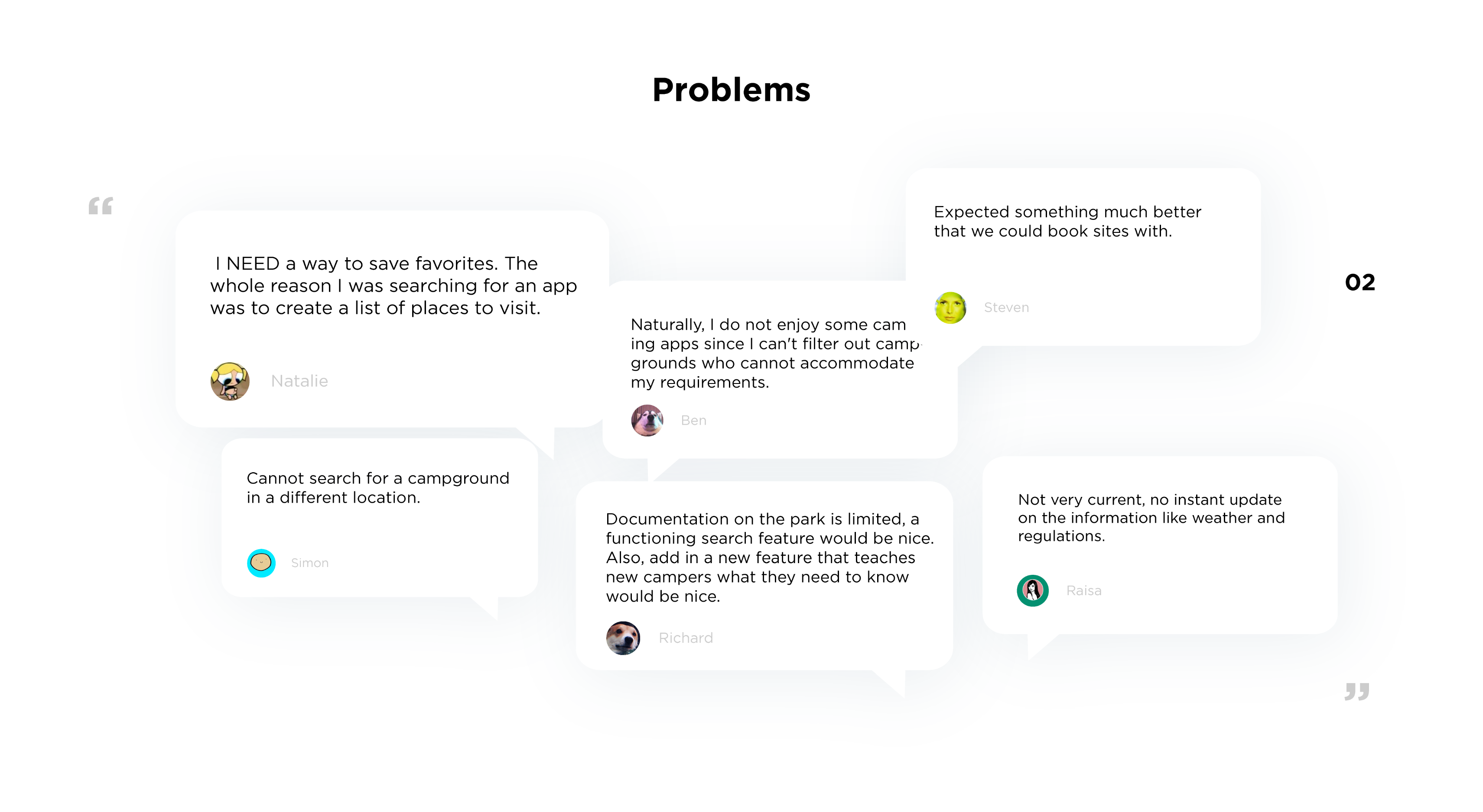
Some of the biggest concern for campers are preparation before camping, and running into technical problem during camping such as “how to set up tents properly”, “what to do when I encounter a bear” and such. Although there are many existing applications for camping, most of these focus on certain campgrounds in one region. Campers are left to find solutions on several browsers and apps when they encounter issues in their camping trips. (see below for users' comments on existing applications)
We began researching for insight on this issue by researching the challenges these existing applications pose. We then took these insights and created our own application interface that could better guide campers on their trips.
With the current travel applications designed camping, we noticed they lack hierarchy in information, and the applications do not interact with users enough to keep them motivated and continue using the app. While most campers camp in groups, most of the application consists of banal and tedious interface that does not allow collaboration on apps for trip planning. Plus, a lot of apps are not accessible while the internet is poor.
Camping has been growing in popularity, however none
of the current applications provide trip planning
and skill learning all in one application, hence we
came up with the idea where users can search up
campsites and learn about camping at the same
time.In addition, according to (Gursoy, Chen & Y.Lu,
2012), only 2% of the population in the United
States camp alone, for that reason, users could use
our application to create and customize checklists
and share information among contacts who are also
taking part in the camping trip rather than relying
on endless struggle of group texts.
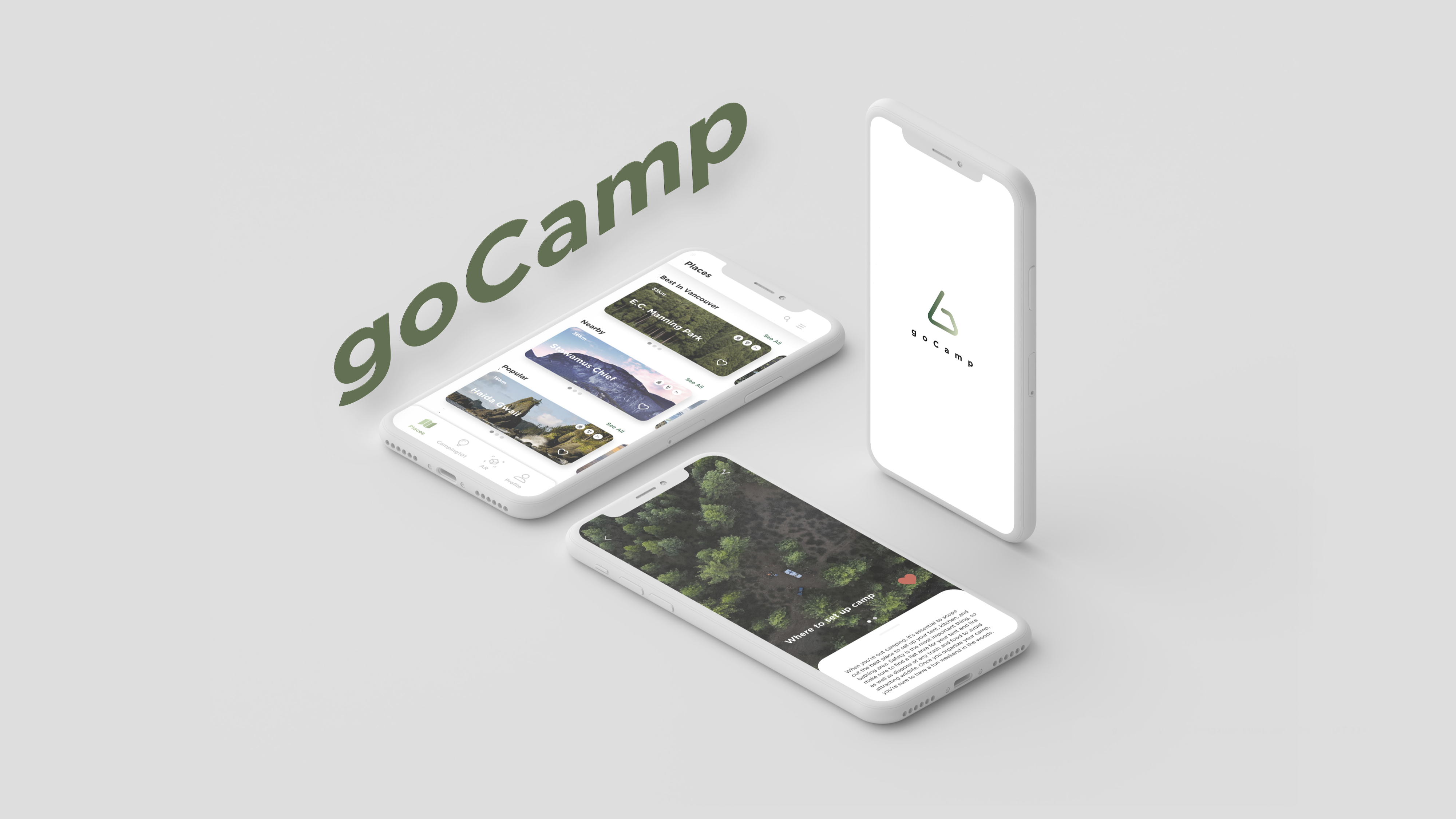
With goCamp, both beginners and experienced campers
can learn about all the information they need to
prepare for their trips. Campers can also view the
saved articles offline and use the AR camera to
detect plants in the wild. The articles provided by
our app will assist in addressing the frequently
asked issues and information.
Planning a camping trip should be a fun, exciting experience that flows smoothly into the
camping journey itself. The proposal of goCamp aims to offer that with a friction-free user
flow. I was satisfied as to how far we went with our project. As the was one of the first user
experience courses I have taken, it was an intense experience to be thrown in the deep end of
integrating design thinking with real business problems that were also drawn from my own
experiences. This project also made me realize the importance of communicating an idea and
executing it at a high level.
However, in hindsight, one part I would have wanted to improve is to consider the overall mobile
experience. For example, the body text on the content pages (Places and Camping 101) is too
small and may not be legible on mobiles. I learned that it is important to create a
mobile-friendly application that allows the user to accomplish their goals efficiently.